- Project Outline -
Project: Logo design.
Team: Individual.
My Role and responsibilities: Design and creation of logo.
Tools used: Microsoft PowerPoint, Adobe Illustrator, ArtFlow.
Date: March 2021.
- Logo Design Iterations -
The MOD logo went through multiple design iterations before coming to the final design.
First logo design iteration
I researched online and found that many people use their name as a logo. I decided to experiment with using my signature as a logo for my website. The idea in my head did not translate well into design. I thuoght the light background and black writing would look simple yet sleek, however it ended up looking messy and unprofessional.
I still liked the idea of using my handwriting in the logo, as it made it feel more personal, so I tested that using just my initials this time. I wanted to add some texture into the background of this logo to make the overall design more interesting. However, I found that it made the logo look very busy and even messier than the first iteration. This is where I decided to abandon the idea of using handwriting and go forward with just text.
Second logo design iteration
Third logo design iteration
I decided to stick with using my initials in the logo as I liked the look of it. It is simply three letters but represents who I am. I felt having just the letters was too simple so I added the flower and sun icon that I found online. While I liked how happy this logo looked, I don´t think it truly represented my brand.
Photography is a big passion of mine
Fourth logo design iteration
Fifth logo design iteration
In the fifth iteration of the logo design I decided to combine the camera and letter into one. When I was younger I would always draw a smiley face in the ´O´ of my name. I think it worked well in this scenario. However, I felt like having just a camera in the centre did not truly represent my brand as whole, simply just a small portion of it.
In this final iteration of my logo design I found a way to incorporate multiple aspects of my personality into one logo that truly represents the various interests that I have. I decided to keep the same font from the previous design iteration because I liked the simplicity and professionalism it represented.
Sixth and final logo design iteration
- Creation of Final Logo Design -
Design process
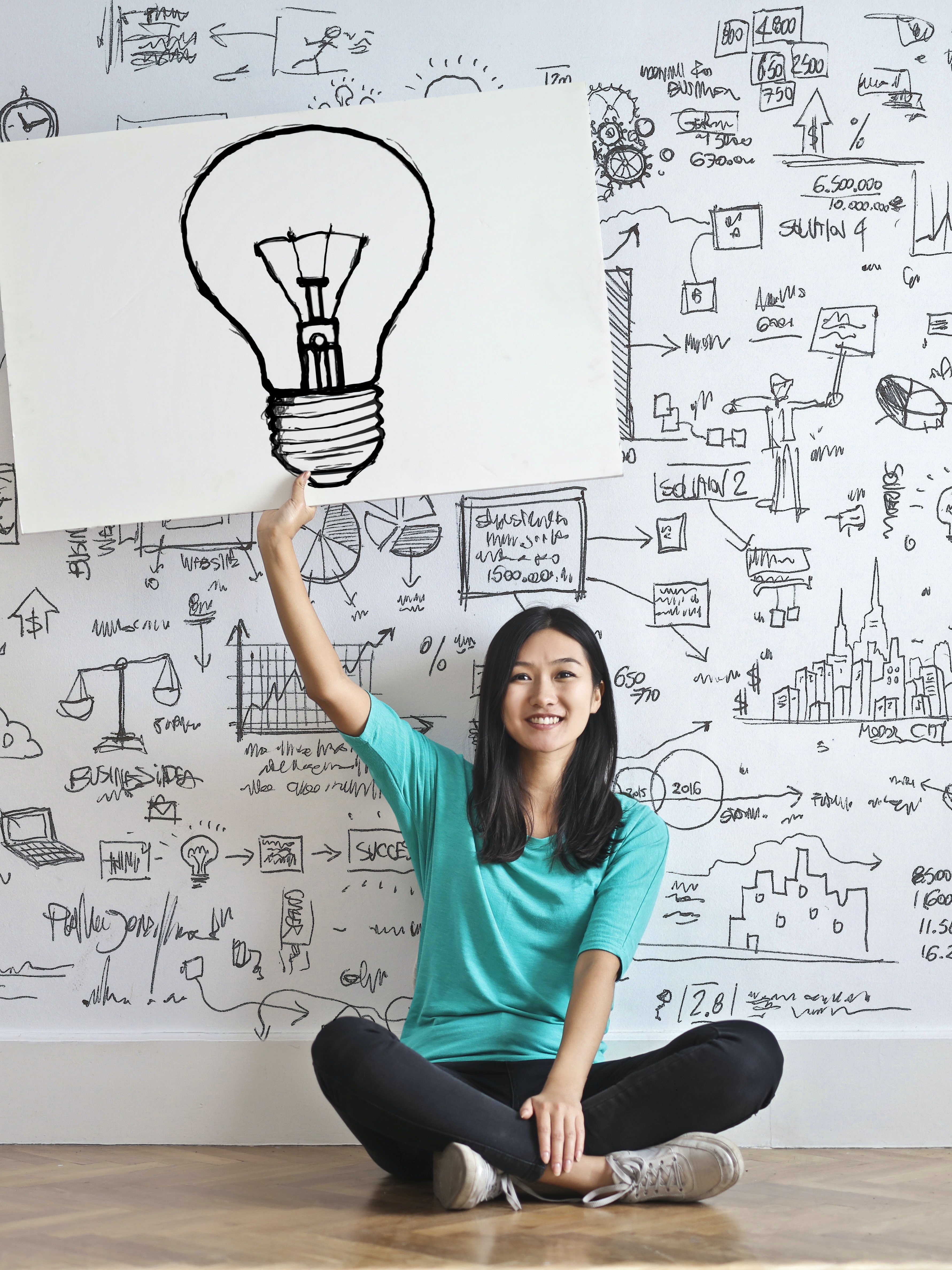
I like to brainstorm my ideas on paper. For this logo I knew that I wanted to incorporate multiple images that reflected who I am as a person. I imagined having just simple lettering with images scattered around the letters. I thought that looked too busy and messy. I knew I wanted something simple and professional looking. I asked myself, where will this logo be used? Currently my only plan is to have it on my portfolio so I thought why not add some animation. I really liked the concept of my fifth design iteration and decided to move forward with a similar design, just with some animation added in.
The final logo design was created on Microsoft Powerpoint. One slide was created and duplicated multiple times so I had 12 identical slides in total. I inserted a different icon on each slide. These icons can be found in the icon library on Powerpoint. I put a thirty second timer on each slide and saved the file in a gif format in order to get the final design.
MOD logo design being created in Microsoft PowerPoint
- What I Learned -
